Most of the logos I'm proud of are ones for small businesses of friends and a few for myself as well. Yet I've still somehow managed to do a ton of them. And inevitably, I rebranded three different ad agencies I worked for.
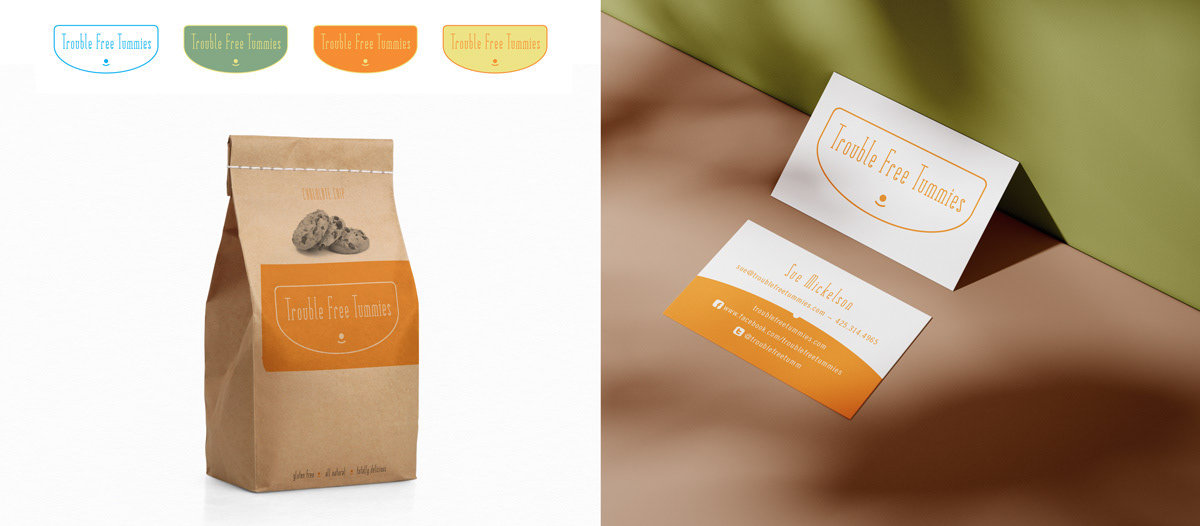
Sue raised kids that all had dietary restrictions. And she had collected a treasure trove of tasty recipes that kids (and adults) with food allergies loved. A design with product line and packaging potential was a goal.
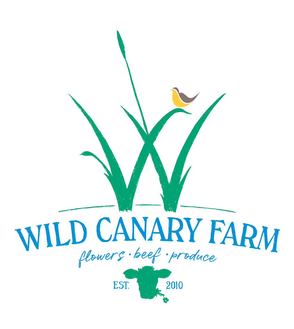
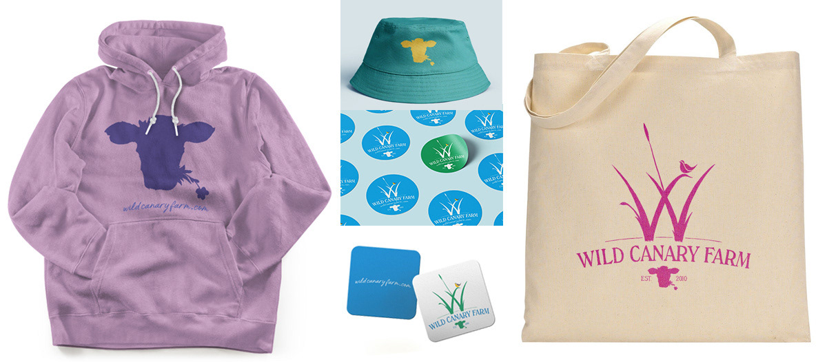
Jim and Katie raised a special type of miniature cow that was adorable enough to make you a vegetarian. Except it was also the best beef you've ever tasted. The secret was the canary reed grass that grew in their damp, sunny pastures. And lucky them, every spring they had a flock of the Washington state bird, often referred to as "wild canary" make a home on their property.
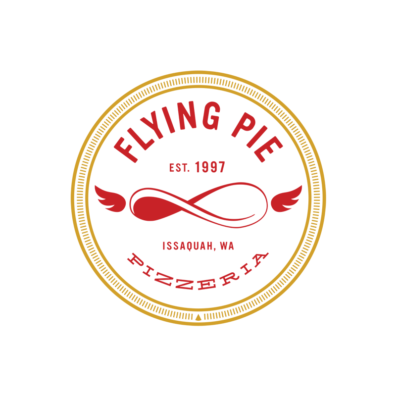
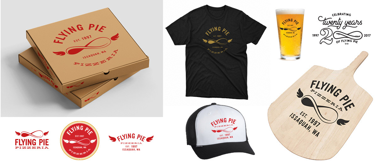
Katherine was a second generation owner of this hand-tossed crust pizzeria. And she was ready to take the business to the next level. The previous logo, featuring a cartoon of an Italian chef tossing dough, was aging poorly. The new design was inspired by graffiti of a winged slice of pizza which she had purposely left on the restroom door.
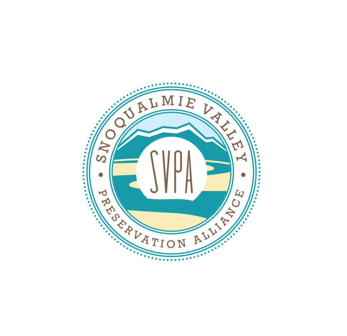

SVPA is a non-profit formed mainly by a group of Snoqualmie Valley farmers that deal with flooding and land use issues galore. They needed a look that showed "We're non-profit" but also said, "We have lawyers."


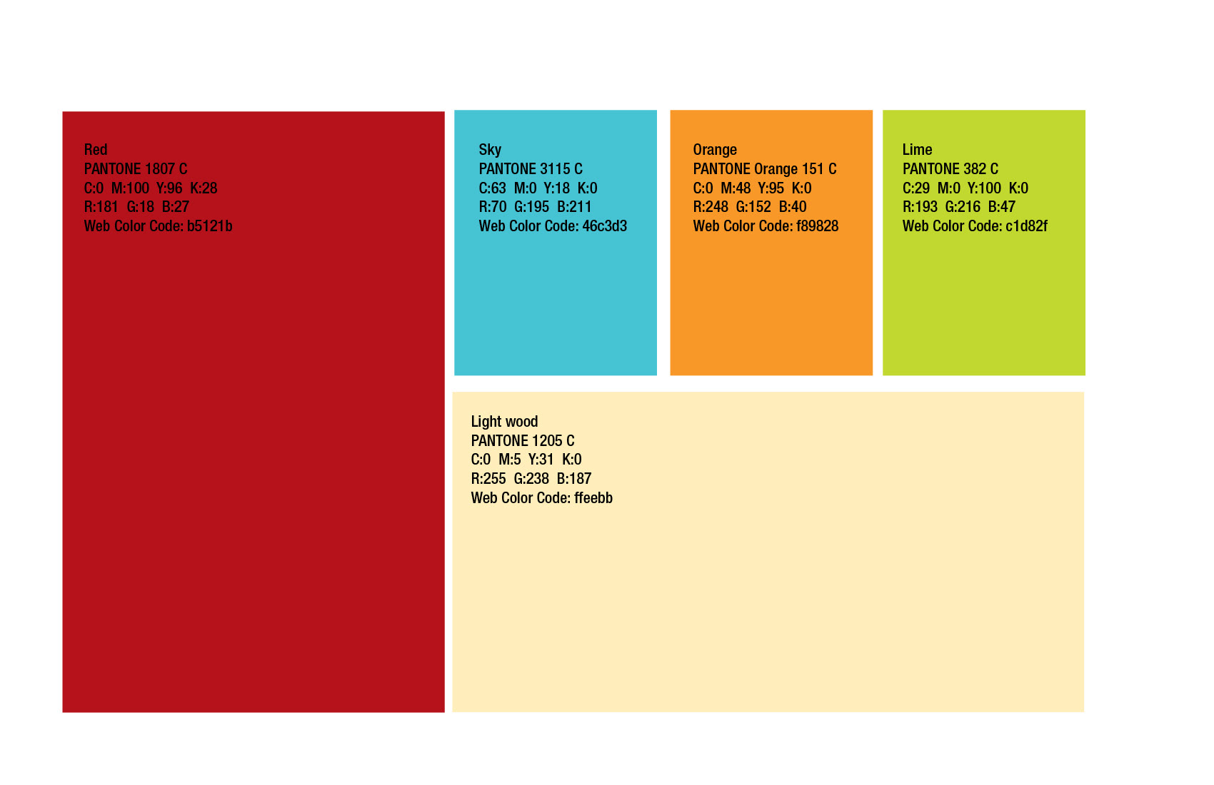

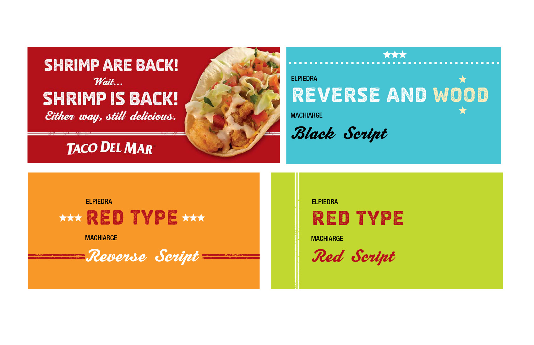
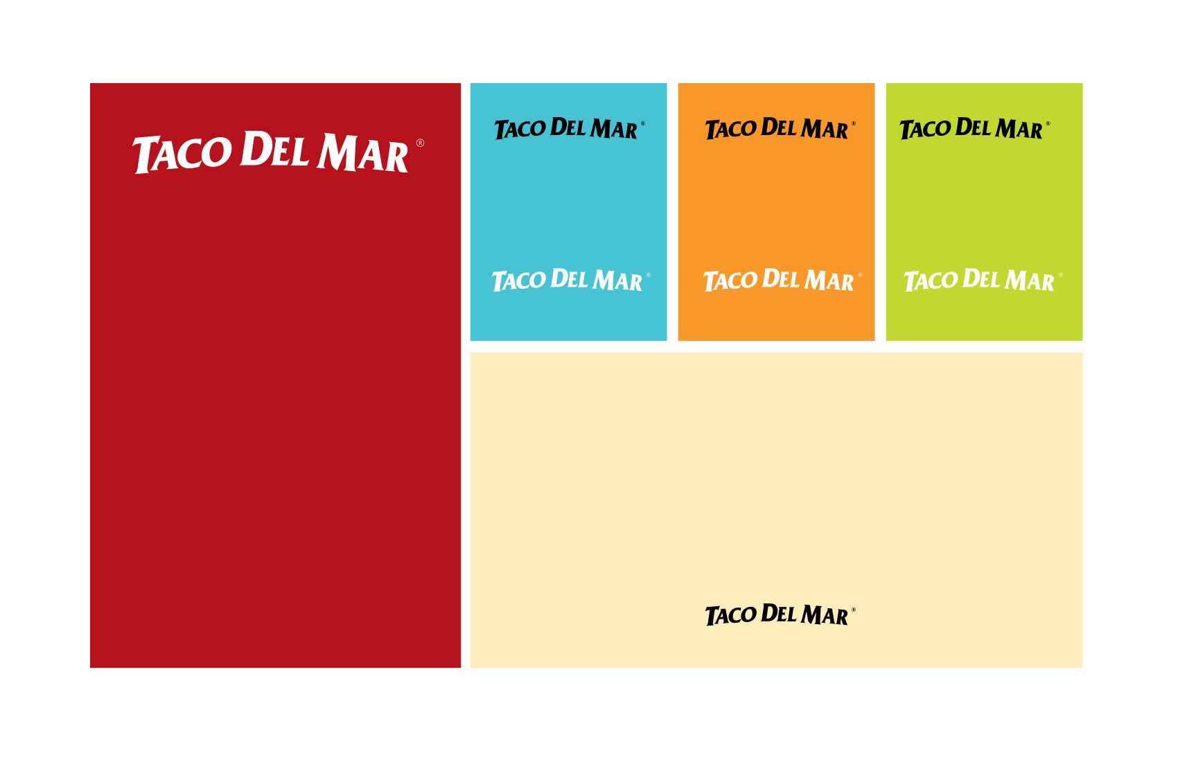
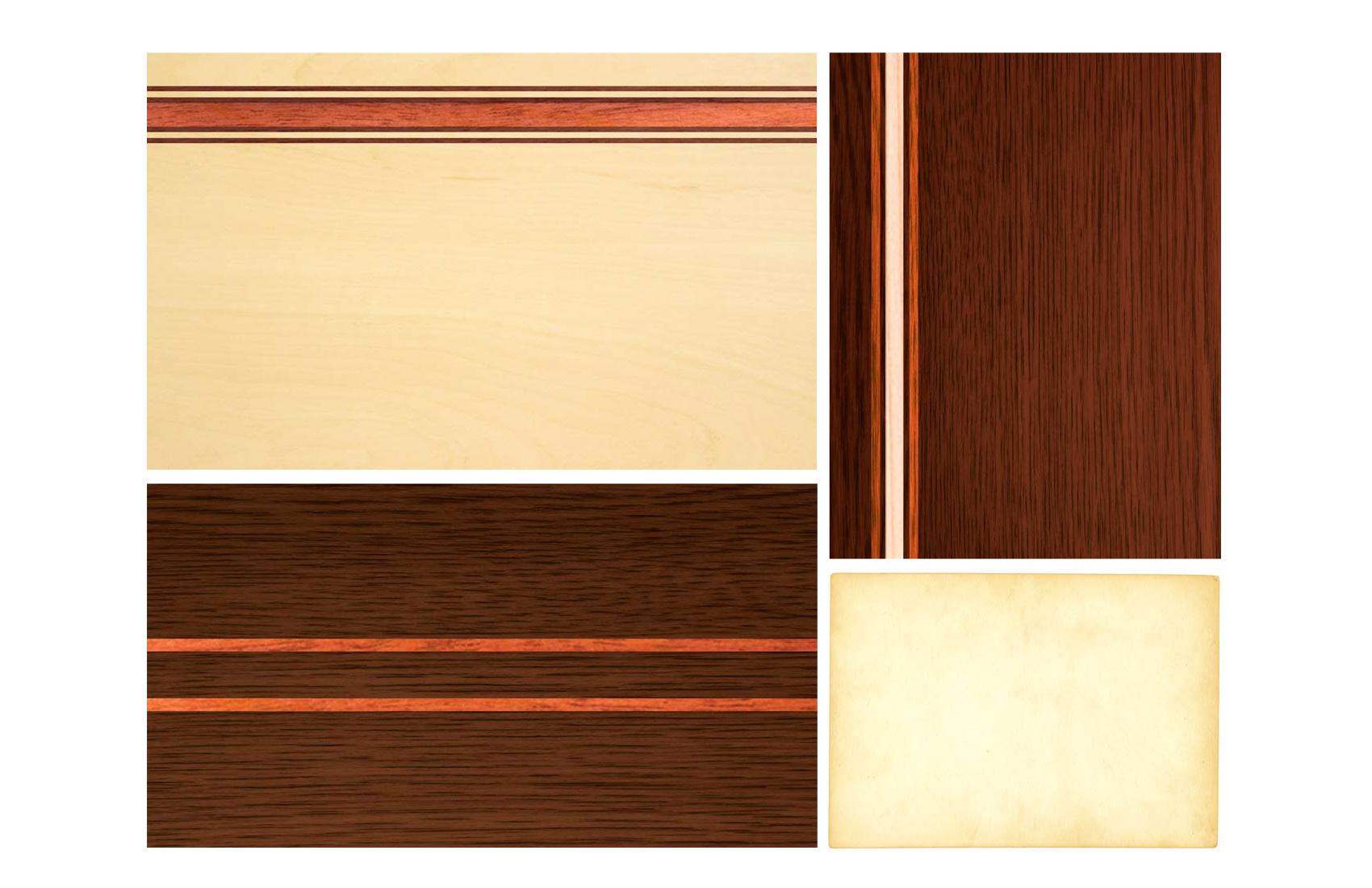
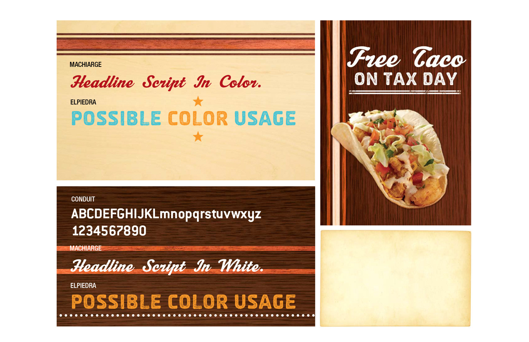
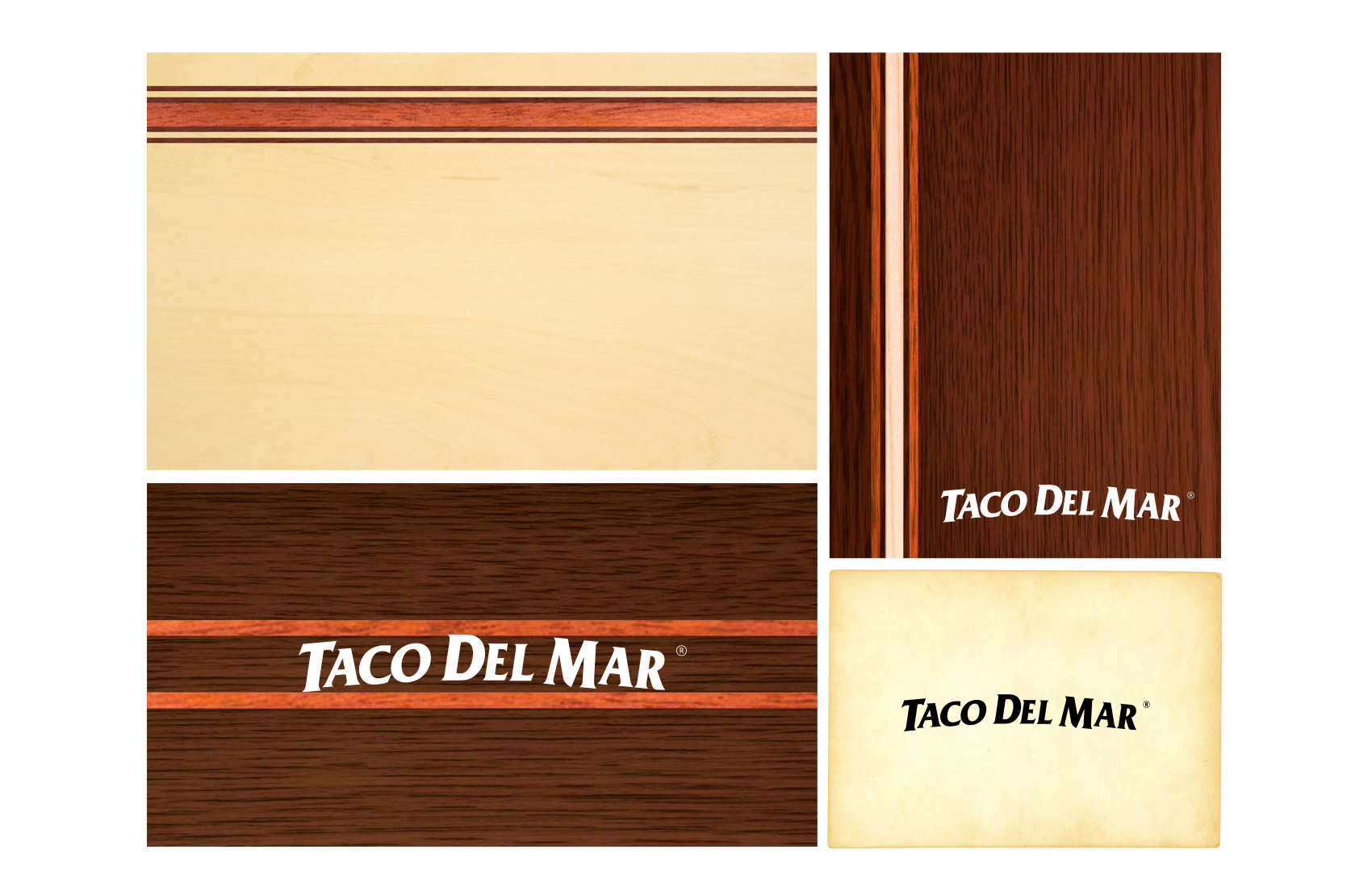
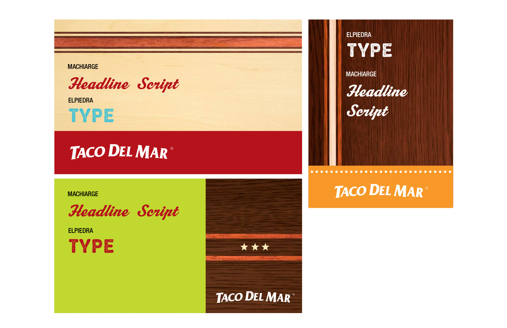
Taco Del Mar Brand Update Resource Book.